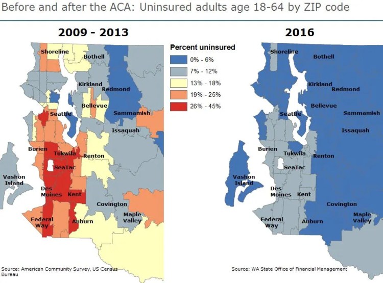
Our epidemiologists at Public Health–Seattle & King County (PHSKC) have been keeping track of insurance enrollment for years. And, for a long time, the picture was getting worse year by year, with increasing numbers of people uninsured. That all changed after 2013, when new insurance options became available under the Affordable Care Act. King County embraced the opportunity to help residents enroll, and PHSKC assumed the lead roll, sending Navigators to every neighborhood and community.
The latest data — when shown on a map of the county — reveals how big the benefit has been for King County residents. (Red, orange and yellow zones have higher rates of uninsured.)

Read more about our enrollment efforts or about how to evaluate new proposals to replace the ACA.
Originally published on May 4, 2017
Excellent map! Really shows the benefits of the still-imperfect ACA